TL;DR
Your gym's website is often a prospect's first impression — and it needs to work harder than a Saturday morning WOD. We rounded up 8 real gym website examples from PushPress Grow customers. Each one demonstrates a different strength: bold branding, clear calls to action, mobile-friendly layouts, and built-in scheduling.
Your gym's website isn't just a digital business card — it's your hardest-working salesperson. It's the first thing most prospective members see, and research shows you have roughly three seconds to make an impression before someone bounces.
The best gym websites do more than look good. They communicate who you are, make it effortless for visitors to take action (book a class, claim a free trial, check the schedule), and reflect the energy and community people will experience when they walk through your doors.
But what does a great gym website actually look like? That depends on your gym's personality, your programming, and the audience you're trying to reach.
We pulled together 8 fitness website examples from real gyms — all built using PushPress Grow — to show the range of what's possible. From a CrossFit box in the Colorado suburbs to a functional fitness co-working space in Miami, these sites prove you don't need a massive budget or a web developer on staff to build a professional, high-converting gym website.
What Makes a Great Gym Website?
Before we get into the examples, it's worth understanding what separates a forgettable gym website from one that actually drives memberships. The best gym website designs share a few common traits:
A clear value proposition above the fold. Visitors should immediately understand what your gym offers and who it's for. The best sites lead with a strong headline and a single, prominent call to action — like "Start Your Free Trial" or "Book a Class."
Professional imagery that reflects your community. Stock photos of fitness models don't build trust. The gyms that convert best feature real members, real coaches, and real moments from their facility. This signals authenticity and gives prospects a preview of the culture they're joining.
Frictionless navigation and mobile responsiveness. Over 70% of gym website traffic comes from mobile devices. If your schedule page is hard to find or your forms don't work on a phone, you're losing leads. Clean navigation with clear pathways — schedule, pricing, programs, contact — is essential.
Built-in scheduling and lead capture. A beautiful website that doesn't let visitors take action is just a brochure. Integrated class scheduling, trial booking forms, and automated follow-ups turn traffic into trials and trials into members.
Fast load times and SEO fundamentals. If your site doesn't load in under three seconds, roughly half your visitors will leave. And if Google can't find you when someone searches "gym near me" or "CrossFit in [your city]," you're invisible to your most motivated prospects.
Now, let's look at the gyms putting all of this into practice.
1. Tonka Fitness — Hopkins, MN
Website: tonka-fitness.com
Gym Type: CrossFit / Functional Fitness / HYROX Training
Tonka Fitness (also known as CrossFit Minnetonka) is a standout gym website example for facilities that offer multiple training modalities. Located in Hopkins, Minnesota, they run everything from CrossFit and HYROX training to bootcamp classes and personal training.

What works well on this site:
- Program-specific landing pages. Rather than cramming all their offerings onto one page, Tonka Fitness gives each program — CrossFit, HYROX, personal training, bootcamp, drop-in — its own dedicated page. This is smart for both user experience and SEO, since each page can rank for its own set of keywords (like "HYROX training Hopkins MN").
- Clear scheduling integration. The class schedule is easy to find and allows prospective members to see exactly what's available before they ever walk in.
- Drop-in friendly. A dedicated drop-in page makes it easy for traveling athletes to book a visit, which builds word-of-mouth and community goodwill.
Design takeaway: If your gym offers more than one program, don't bury them on a single page. Dedicated program pages improve navigation, help with local SEO, and let you speak directly to different audience segments.
2. Just Train HQ — Chatsworth, CA
Website: just-train-hq.com
Gym Type: Strength & Conditioning / CrossFit Hybrid
Just Train HQ blends CrossFit with traditional strength and conditioning in Chatsworth, CA, just northwest of Los Angeles. Their website reflects the gym's no-nonsense, results-driven training philosophy.

What works well on this site:
- Bold, direct messaging. The gym's brand voice comes through immediately — it's clear this is a place for people who take their training seriously. The headline and copy don't try to be everything to everyone, which actually makes the brand more compelling.
- Location-specific content. Highlighting their Chatsworth location with neighborhood context helps with local search visibility. When someone Googles "strength and conditioning gym Chatsworth," this site is positioned to show up.
- Drop-in and visitor-friendly. Like Tonka Fitness, Just Train HQ makes it easy for visiting athletes to find and book a session, widening their reach beyond just the local market.
Design takeaway: Don't be afraid to have a strong brand voice. A gym website that tries to appeal to everyone often appeals to no one. Know your ideal member and write directly to them.
3. MissionFit — Wilmington & Leland, NC
Website: wearemissionfit.com
Gym Type: Group Fitness / Strength & Performance
MissionFit operates two locations in the Wilmington, NC area — one in Wilmington and another in Leland. Their site is an excellent gym website example for multi-location fitness businesses.

What works well on this site:
- Multi-location structure done right. Managing two gym locations on one website can get messy, but MissionFit handles it cleanly. Each location has its own schedule, contact info, and details, while the overall brand stays unified.
- Clear onboarding pathway. Their "Get Started" page walks newcomers through exactly what to expect, reducing the anxiety that keeps many first-timers from ever stepping foot in a gym. A "Launch" program for beginners lowers the barrier to entry even further.
- Pricing transparency. Putting pricing information on the website is a debated topic in the gym industry, but MissionFit makes it accessible — which builds trust and pre-qualifies leads before they reach out.
Design takeaway: If you have multiple locations, structure your website so each one has its own presence while maintaining a single cohesive brand. And consider being transparent about pricing — it saves time for both you and your prospects.
4. GRIT Miami — Miami, FL
Website: gritmiami.com
Gym Type: Hybrid Functional Fitness / Co-Working Gym Space
GRIT Miami nails the balance between bold branding and a clear path to getting started. Their homepage leads with a strong message — they help you build strength, confidence, and "grit" through a comprehensive hybrid program — and the rest of the site backs it up with substance.
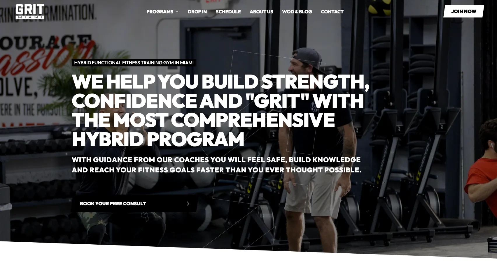
What works well on this site:
- A dead-simple onboarding flow. The "Getting Started Is Easy" section breaks the process into three numbered steps: schedule a consult, get tailored guidance, trust the process. This removes friction and makes the gym feel accessible, even for first-timers who might be intimidated. It's one of the most effective onboarding layouts we've seen.
- Comprehensive service grid. Rather than just listing classes, GRIT Miami visually maps out everything they offer — weekend workout classes, nutrition programming, party/class scheduling, personal training, a members-only app, and individualized programming. Presenting this as a visual grid (not a wall of text) makes the breadth of services feel organized, not overwhelming.
- Strong local positioning. Calling out "Located in the Heart of South Miami, Behind Dadeland Station" gives the site a neighborhood anchor that helps with local search and makes the gym easy to find.
Design takeaway: If your gym website has strong programming but a complicated signup process, study how GRIT lays out their onboarding steps — simplicity sells.
5. Wolfe Den CrossFit — Mornington, VIC (Australia)
Website: wdcf.com.au
Gym Type: CrossFit / HYROX / 24-7 Training
Wolfe Den CrossFit sits on the beautiful Mornington Peninsula in Victoria, Australia, and serves as proof that the PushPress Grow gym website builder works just as well for international facilities. With a second location recently opened in Dromana, they're scaling smart.
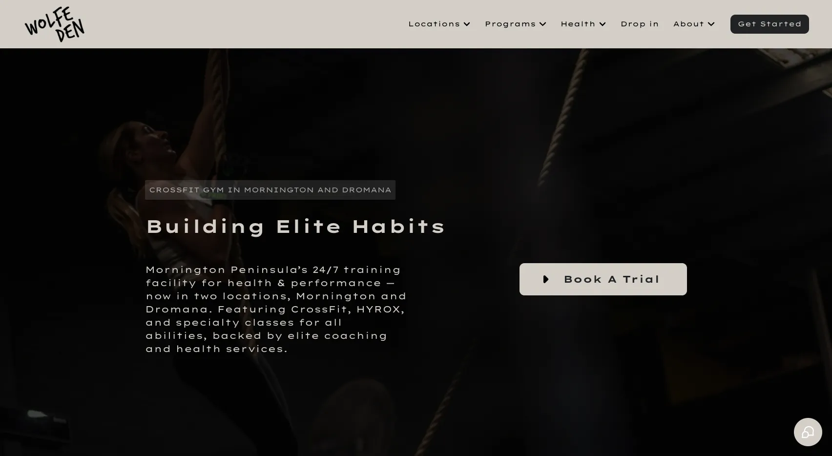
What works well on this site:
- Beginner-friendly pathway. A dedicated "Beginners" page and a clear "Get Started" flow make the gym approachable for people who might feel intimidated by the CrossFit label. This is critical for widening the top of the funnel.
- Comprehensive service offering. Beyond CrossFit classes, Wolfe Den integrates health services like physiotherapy, nutrition coaching, and specialty classes — and their website communicates this breadth without feeling cluttered.
- 24/7 access highlighted. For members who train outside of coached class times, the 24/7 access is a clear differentiator that's prominently featured.
Design takeaway: A clear beginner pathway can be the difference between a curious visitor and a signed-up member.
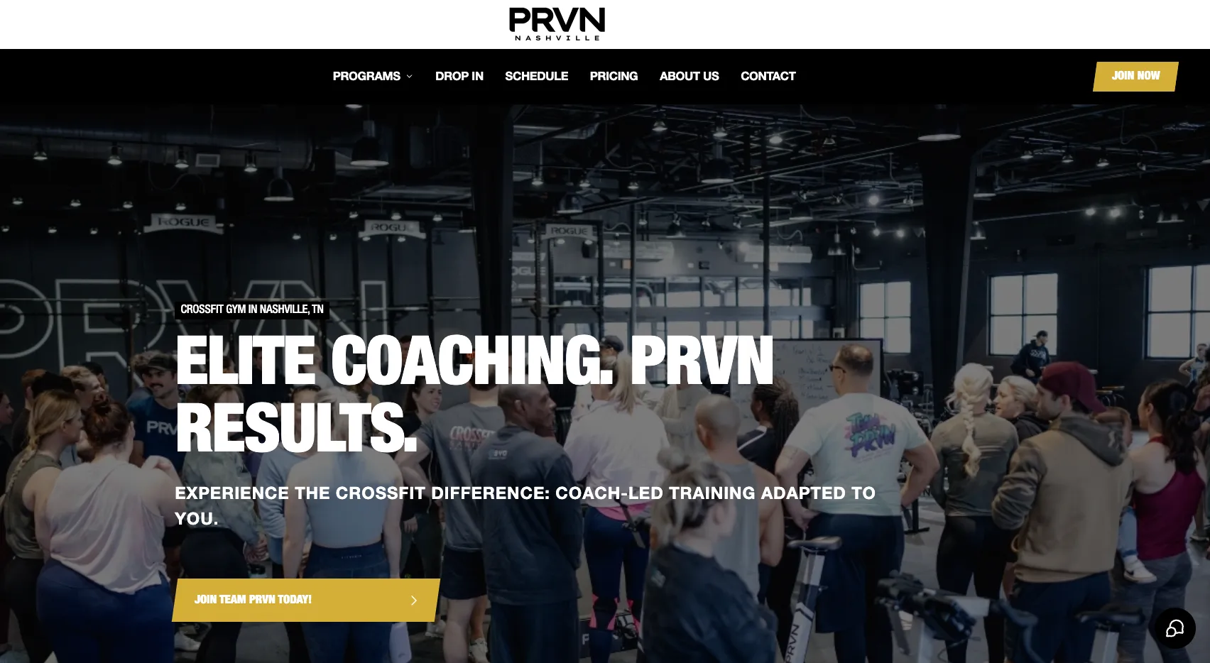
6. PRVN HQ — Nashville, TN
Website: prvnnashville.com
Gym Type: CrossFit / HYROX / Community Fitness
PRVN HQ in Nashville, TN isn't just another gym — it's the flagship headquarters of the PRVN Fitness brand, a name that carries serious weight in the competitive fitness world. This is the location that sets the standard for the entire franchise, and their website reflects that. It needs to do double duty: representing the PRVN brand at its highest level while also serving as the local gym's primary conversion tool.

What works well on this site:
- Flagship credibility on full display. As the headquarters location, PRVN HQ's website carries the authority of the entire brand. The site communicates that this isn't a satellite location following someone else's playbook — this is where the playbook is written. That kind of credibility is powerful for converting both local prospects and visitors who seek out the PRVN experience at the source.
- Community-first messaging. The site emphasizes a "fully integrated community experience" focused on health, fitness, and daily well-being. This positions the gym as more than just a place to work out — it's a lifestyle. For a flagship location, this messaging also sets the tone that franchisees and affiliated gyms can follow.
- Premium positioning that matches the brand promise. Highlighting state-of-the-art equipment, elite coaching, and a world-class training environment reinforces that this is the standard-bearer for the PRVN brand. When your website is the face of an entire franchise, every detail matters — and PRVN HQ delivers.
Design takeaway: If your gym is the flagship or headquarters of a larger brand, your website should set the gold standard. It's not just a local gym site — it's the benchmark that defines the brand experience for every other location. Lean into that authority.
7. Park City Fit — Park City, UT
Website: parkcityfit.com
Gym Type: Group Fitness / Personal Training / Recovery
Park City Fit serves the active community of Park City, Utah — a town known for skiing, outdoor recreation, and an adventurous population. Their website does a fantastic job of reflecting the local lifestyle and going beyond just workouts.

What works well on this site:
- Recovery as a differentiator. While most gym websites focus exclusively on classes and training, Park City Fit prominently features a recovery room with NormaTec boots, massage guns, and stim — free for all members. This signals a gym that cares about the full picture of fitness, not just the workout.
- Award-winning credibility. The site highlights their 2022 Best Gym in Park City award, which adds social proof and builds trust with new visitors. If you've won any local awards or recognitions, put them on your website.
- Drop-in and visitor focus. In a tourist destination like Park City, catering to visiting athletes is a smart business move. Their drop-in page makes it effortless for out-of-towners to book a session.
Design takeaway: Think about what your gym offers beyond the workout. Recovery amenities, community awards, and lifestyle touches can be powerful differentiators on your website — especially in competitive markets.
8. CrossFit Tackle Bunny — Centennial, CO
Website: crossfittacklebunny.com
Gym Type: CrossFit
CrossFit Tackle Bunny in Centennial, Colorado (just south of Denver) rounds out our list with a gym website that proves a memorable name goes a long way. The brand is fun, approachable, and instantly recognizable — qualities that carry through to the website.

What works well on this site:
- Memorable branding. Let's be honest — you're not going to forget the name "CrossFit Tackle Bunny." A distinctive brand name paired with consistent visual identity makes this gym stand out in a crowded market. The website reinforces this personality throughout.
- Straightforward group training focus. Rather than trying to list a dozen different programs, CrossFit Tackle Bunny keeps things simple: group training is the core offering, and the site communicates this clearly without unnecessary complexity.
- Strong local presence. With a clear address in Centennial, CO and operating hours prominently displayed, the site covers the basics that Google (and prospective members) need to see.
Design takeaway: Don't underestimate the power of a unique brand name and personality. If your gym has a story behind its name, tell it. Personality builds connection, and connection drives conversions.
What These Gym Websites Have in Common
Looking across all eight examples, a few patterns emerge that any gym owner can learn from:
They all lead with action. Every site makes it easy for visitors to take the next step — whether that's booking a class, starting a free trial, or checking the schedule. The call to action is never more than one click away.
They feature real community. None of these sites rely on generic stock photography. Real coaches, real members, and real training moments create authenticity and trust.
They're built for mobile. Given that the majority of gym website visitors come from smartphones, all eight sites are responsive and functional across devices.
They keep it simple. The best gym websites aren't cluttered with information. They prioritize clarity — what the gym offers, who it's for, and how to get started.
They're powered by PushPress Grow. Each of these sites was built with PushPress Grow, which means scheduling, lead capture, and member management are baked in from the start — not bolted on as an afterthought.
Build a Gym Website That Converts
If these gym website examples have you rethinking your own site, you're not alone. Most gym owners know their website needs work — they just don't have the time (or the web development budget) to do anything about it.
That's exactly why PushPress Grow exists. Grow is a gym website builder designed specifically for fitness businesses. It gives you a professional, mobile-optimized website with built-in scheduling, lead capture, automated follow-ups, and SEO fundamentals — without needing to write a line of code or hire a designer.
Every gym on this list built their site with Grow. And the result isn't just a good-looking website — it's a website that actually drives new members through your door.
Pro Tip: Want to learn how PushPress Grow can create a high-performing, SEO-optimized website for your gym? Book a demo with our team today!
Frequently Asked Questions
What should a gym website include?
At minimum, a gym website should include your class schedule, program descriptions, pricing or a way to request pricing, location and contact information, a clear call to action (like "Book a Free Trial"), and imagery that reflects your gym's community and culture. Integrated scheduling and lead capture tools are critical for converting visitors into members.
How much does it cost to build a gym website?
Costs vary widely. Hiring a freelance web designer typically runs $2,000–$10,000+, while DIY website builders range from $15–$50/month. PushPress Grow offers a gym-specific website builder with integrated gym management tools, which eliminates the need to piece together separate platforms for your website, scheduling, and lead follow-up.
What's the best website builder for gyms?
The best gym website builder depends on your needs, but purpose-built platforms like PushPress Grow are designed specifically for fitness businesses — meaning you get scheduling, lead capture, and member management built in, rather than relying on generic builders and third-party plugins. Generic platforms like Squarespace and Wix work for basic sites but lack fitness-specific features.
How can I make my gym website rank on Google?
Focus on local SEO fundamentals: claim and optimize your Google Business Profile, include your city and neighborhood in your page titles and headings, create dedicated pages for each program you offer, collect and respond to Google reviews, and make sure your site loads quickly on mobile. Publishing helpful blog content related to fitness in your area can also boost your visibility over time.

The PushPress Podcast
Helping gym owners build better businesses, one episode at a time.
Ready to scale your fitness business?
Try our hassle-free Gym Management Software loved by thousand of successful Gym Owners.
PushPress is the reason my gym became profitable.
How AI Coaching Tools Help Gym Coaches Build Stronger Member Relationships
See how one gym coach uses AI to greet new members, celebrate birthdays, and coach around injuries — without adding a single task to his plate.

The Coach Scheduling Template That Takes You Out of the Equation
Build a customized gym class schedule template and staff scheduling SOP in 5 minutes. Free interactive tool based on real gym owner systems.
8 Gym Website Examples That Nail Design & Conversions
Looking for gym website design inspiration? These 8 real fitness website examples show what works — from bold branding to seamless scheduling. See what top gyms are doing right.
Follow along and build a better gym with us
Get actionable strategies and ideas to help you grow your gym and manage it successfully, in your inbox every week!